v4.4.2
Fixed incorrect handling of controller-based LNPopupUI/SwiftUI title views (#631); thanks zhanglei-workspace for investigating
v4.4.0
LNPopupController now requires Xcode 26.0+ to compile, but still supports iOS 13.0 as the lowest deployment target.
See https://github.com/LeoNatan/LNPopupController/issues/619 for more info.
v4.3.7
- Improvements to marquee label layout and animations
- Fixed an iOS 15 crash (#628)
v4.3.5
Fixed an issue related to LNPopupAppearance (#627)
v4.3.4
- Fixed an issue where popup item paging might break in spectacular ways due to an Apple bug 🤦♂️
- Popup bar item metrics and spacing have changed; if you’ve previously set the
widthof a bar button item or sized your custom bar button item view with additional padding, this may no longer be necessary - Fixed a multitude of layout and logic issues, going back to iOS 16
- Fixed several crashes on older iOS versions
v4.3.3
- Popup bar item metrics and spacing have changed; if you’ve previously set the
widthof a bar button item or sized your custom bar button item view with additional padding, this may no longer be necessary - Fixed a multitude of layout and logic issues, going back to iOS 16
- Fixed several crashes on older iOS versions
v4.3.2
- Popup bar item metrics and spacing have changed; if you’ve previously set the
widthof a bar button item or sized your custom bar button item view with additional padding, this may no longer be necessary - Fixed a multitude of layout and logic issues, going back to iOS 16
- Fixed several crashes on older iOS versions
v4.3.1
4.3.1
- Fixed a button style logic on iOS 18.x and earlier.
4.3.0
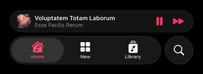
Introducing popup item paging in popup bars!
For this, a new popup item management mode is introduced.
In this mode, you provide a data source to the popup bar, which can provide one or more popup items. This decouples the popup item from the content controller and allows for more advanced scenarios, such as popup item paging. You activate this mode by setting popup bar's usesContentControllersAsDataSource to false.
Before presenting a content controller, you must either provide an initial popup item or set the popup bar's data source, and implement initialPopupItem(for:) optional method. The system will use this popup item for popup bar presentation. Updates to popup items are tracked, and the popup bar is automatically updated with the latest information.
At any point, you can set the popup bar's popupItem with a new popup item. Whenever a popup bar's popup item changes, the UIViewController.popupItemDidChange(_:) method is called to let the content controller know its popup item has changed.
class PopupContentViewController: UIViewController {
	init() {
		// ...
	}

	override func popupItemDidChange(_ previousPopupItem: LNPopupItem?) {
		// Handle updating the content view hierarchy with the new popup item
	}
}

func presentPopupBar() {
	tabBarController?.popupBar.usesContentControllersAsDataSource = false

	let initialPopupItem = LNPopupItem()
	initialPopupItem.title = "Hello Title"
	initialPopupItem.subtitle = "And a Subtitle!"
	initialPopupItem.progress = 0.34
	initialPopupItem.barButtonItems = [/* ... */]

	tabBarController?.popupBar.popupItem = initialPopupItem

	let contentVC = PopupContentViewController()
	tabBarController?.presentPopupBar(with: contentVC)
}
Popup Item Paging
When implemented, the popup bar allows the user to page between different popup items through swiping on the title views.
To implement, you must set the popup bar's data source, and in it, implement both popupBar(_:popupItemBefore:) and popupBar(_:popupItemAfter:). Optionally, you can also set a popup bar delegate and implement popupBar(_:didDisplay:previous:) to be notified when a new popup item is displayed (in addition to the popup content controller's UIViewController.popupItemDidChange(_:) call).
func presentPopupBar() {
	// ...
	tabBarController?.popupBar.dataSource = self.model
	tabBarController?.popupBar.delegate = self
	// ...
}

// MARK: LNPopupDataSource

func popupBar(_ popupBar: LNPopupBar, popupItemBefore popupItem: LNPopupItem) -> LNPopupItem? {
	// Return a popop item representing the content before `popupItem` or `nil`
}

func popupBar(_ popupBar: LNPopupBar, popupItemAfter popupItem: LNPopupItem) -> LNPopupItem? {
	// Return a popop item representing the content after `popupItem` or `nil`
}

// MARK: LNPopupDelegate

func popupBar(_ popupBar: LNPopupBar, didDisplay newPopupItem: LNPopupItem, previous previousPopupItem: LNPopupItem?) {
	// Called when the popup bar's popup item changes (in addition to the content controller's `UIViewController.popupItemDidChange(_:)` call)
}
[!NOTE] In this mode, carefully consider how you route data between the different components of your app. The framework provides as much information as possible to trigger updates in your content as a response to programatic and user changes to popup items.